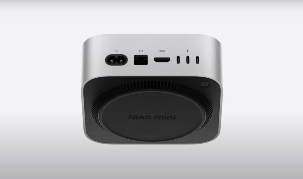
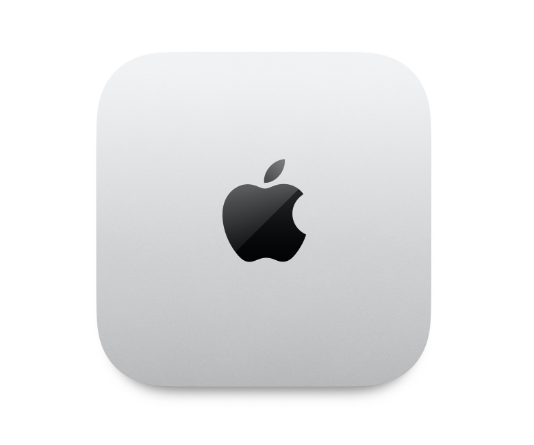
Apple just revealed its smaller Mac Mini with M4 processors, up to 64GB RAM, Thunderbolt 5 support, and more. Despite a slimmed-down package, Apple has added more USB-C ports to keep up the connectivity game. To fit in everything, Apple needed a new location for the Power Button. And guess, which place Apple has chosen? The ‘Bottom’ of the Mac Mini. Yes, you’ve heard it right.
For years, users have been dealing with Apple’s controversial design choice of putting the charging port at the bottom of the Magic Mouse. And now, the giant has slapped the Mac mini power button underneath the device. Specifically, it is positioned toward the left rear of the device, when looking at the front of the machine, right below the three Thunderbolt ports. That means you’ll have to tip the Mac mini to reach underneath whenever you need to switch it on or perform a force restart if it locks up.

Honestly speaking, this doesn’t seem a user-friendly choice. Imagine you need to use the hard power-off option, you’ll have to pick up the entire machine. This feels inconvenient and kinda annoying, especially if you have multiple cables hooked in and your Mac is running hot. In the M2 Mac Mini, the power button was on the right rear of the device. To access it, you have to reach behind the device, but it does not require moving the unit.
While some people are annoyed by this move, some do not consider this as a weird design choice. Some users feel moving the Power button to the bottom genuinely makes the M4 Mac mini look aesthetically pleasing from the top. This aligns with Apple’s minimal design language philosophy and might please superfans who enjoy Apple products.

Apple has been rightly criticized and mocked for placing the Magic Mouse’s charging port at the bottom. This year, despite moving from Lightning to USB-C port, Apple didn’t bother fixing its notoriously frustrating design choice that has baffled users for years. Unlike the Magic Mouse’s charging port, moving the Power Button to the bottom not be a huge mistake with the Mac mini. Generally, Macs don’t often need to be turned off, and most people put them into sleep mode rather than shutting them down on a daily basis. That means, most people don’t often access the power button on a desktop machine.
Some people may also argue why Apple didn’t keep the Power Button at the back or move it to the side. It seems since Apple has reduced the size of the machine while keeping the number of ports intact, there wasn’t room to fit in the Power Button. Well, there isn’t any engineering reason, we can just make a guess.
No matter what the reasons or excuses are, Apple’s decision has raised questions and there’s a whole lot of debate going on. If you use the physical power button to turn on/off your machine, I can understand your pain. I hope Apple doesn’t come up with another weird design choice.
What do you think about Apple’s decision to place the Mac Mini’s Power button at the bottom? We’d love to hear from you in the comments below.